Note: You can download Design here.
A Windows Store app needs a logo. As a matter of fact, a Windows Store app needs a logo, a wide logo, a small logo, and a store logo. That’s not so bad, right? Trust me when I say, creating your logo in Design or a tool like Design will save you a lot of heart ache.
Since I just did this for my Free Timer app, I’ll share my technique.
Windows 8 is resolution independent. This means two devices with different physical sizes renders the same sized text and touch points. A 2 inch box is always 2 inches. However, two devices with different pixel resolutions are served different image assets. This prevents needless memory use in lower resolution devices, and pixilation in higher resolution devices.
The is the Visual Studio interface to setup your App Manifest:
This can only work, however, if the developer supplies various sized versions of the same image. For this reason, the 4 images I mentioned above multiply into 19. The logo is mostly repeating over and over in different resolutions. If creating a logo is tedious, creating 19 different sizes of it is excruciatingly so. That’s why Design can be your best friend in this task.
19 isn’t 23!
This article isn’t titled “Windows 8 apps need 19 logos”, it’s called “Windows 8 apps need 28 logos” so what’s next? We’re missing 4 images! Many developers skip this step. I might even say most developers skip this step. But I don’t think you should.
When a developer publishes a title, the Store Submission wizard asks for Store Promotional images. These are images used to promote your app in the Store if you are lucky enough to be selected. Without them you will never be promoted. You need to plan for success.
This is the Windows Store submission wizard for Promotional Images:
Let’s get back to planning for success. That’s because without a promotional image in your submission, you are planning for failure – or at least mediocrity. Don’t be that guy. Don’t submit that app. If you worked hard on an app, then work hard to promote it, too.
Here’s the Store layout for a promotional image:
The images you need
If you were going to be thorough in your app submission, you will submit every asset. But what exactly do you need? First, check out this visual of the assets I have created for my Free Timer app. This snap of my Assets folder makes it clear, there are a lot to create:
Here’s the full list of what you will need to create:
| Square Assets | Wide Assets | Odd Assets |
| Logo
Small Logo
Store Logo
| Wide Logo
Splash Screen
| Promo Images
|
Where are all of these used?
That’s a good question! When you think about it as just four images, it’s a little easier to grasp. All the sizes, that’s exhausting. But here’s where they show up:
- Logo – this image is used for the primary tile of your app.
- Small Logo – this is used in the Start Menu’s semantic zoom, in the List All Apps, in the Search Contract, in the Protocol Chooser, and anywhere else your app might show up.
- Store Logo – this is used in, um, the Store.
- Wide Logo – this is used on the Start Menu as your primary wide tile. it is worth noting that a wide tile is not required, and suggested that you skip it if your tile is not “live”.
What about Design?
Did I already mention how much I like Design? What a great tool. Did I also already mention how much I love that Design is now free to everyone? What a great tool.
The first thing you need to understand with Design is what a Slice is. A Slice, according to the documentation, “lets you export a part of your artwork instead of the whole piece. Or, you can create multiple slices that display the same parts of your artwork, but configure different export properties on each slice to export the artwork in multiple file formats [and sizes]”.
Step by step
Step 1 – create a blank canvas

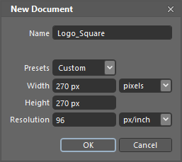
The size of your document is important. You should always create the base canvas the size of your largest asset. In the case of the square logo, the largest is 270x270 pixels. It’s worth noting that since the resulting drawing is vector-based, you can scale up and down quite easily.
Step 2 – Create slices
Here’s where the magic is. Creating a slice is simple. Just create one and copy/paste the others. The slice tool lets you draw a box (or a slice) anywhere. But in this case you want to make the slice boundary identical to the canvas. If they don’t match, your exported images will not include all your artwork.

PROPERTY 1: NAME
The slice name is a handy way for you to recognize a slice while inside Design. But, most importantly, the slice name will be the default file name when a slice is exported. Because you want to make this an easy and repeatable process, name your slices smartly. I put the size in the name and keep it short. But that’s me.
PROPERTY 2/3: HEIGHT/WIDTH
The slice height and width are really important here. Every slice you create correlates to one of the square resolutions listed in the table (above). As you create a slice, meticulously ensure the resolution is correct because when you submit your app, they must be pixel-perfect.

Of course, you can add it back if you want. But, hiding a slice from the canvas let’s you draw your artwork without mistakenly clicking on the layer boundary and changing it. Truth is, you never need to see those layers again.
Step 3 – create your logo
I can’t do this part for you. And if this is your first time with Design, you will need to poke around at it to be successful. As a general rule, introducing bitmap images isn’t a good idea because those do not scale very well. Keep to vectors as much as you can. The power and flexibility of Design is impressive, but with that much power – there’s going to be a learning curve. It’s worthwhile.
Step 4 – export
Having the various slices defined in your document lets you easily export all the various sizes quickly and over and over and over without pain. Just hit CONTROL+E for Export. The resulting dialog will show all your slices with the filename you defined. They will also be sized as you have defined, too. Just make sure the Output Folder is correct and click EXPORT ALL.
Remember, these steps only solve the square image. For each other asset with differing aspects, you need a dedicated document. The process is identical, and the results are just as easy. As I mentioned earlier, I ended up with seven Design document files before I was done. Now, though, when I need to make a change in any way, it’s a trivial task to update them all.
Better than a resize tool?
This creates your bunches of square images. But is this effort better than a simple resize tool? Yes it is. A resize tool takes a bitmap and tries to resize it. As it scales up, it introduces artifacts. As it scales down, it pixelates. But resizing a vector-based image, you can scale all you want and get the best results every time.
Best results are not always great.
Yes you can get the best results with vector-based images. But remember this, once you get to the small images, like 16x16, or even 40x40, sometimes your larger designs just wont work. If your design doesn’t look legible in smaller images, you might need a second document dedicated to the smaller images in the list. But if you are luck (or careful) you can use just one document.
Other images you need
Your Store app will also need screenshots. The easiest way is to use the simulator set at 1366x768. But as a word of advice around screenshots, remember that potential users won’t flip through all your screenshots if the first one is boring or just a snap of your stupid splash screen. Remember, our goal is to get users and downloads and make lots of money! Right?
Let’s see it in action
Sometimes seeing is believing. I’ll take a minute and show you how to do this. Watch the video below and hopefully this will be easier than you ever thought.
And that’s it. There are several extra steps to help increase your app’s success in the Store. It’s nice that there are tools to help make some of those steps easier.
Best of luck!
PS: be a friend, download and rate my app! New version publishing in a week.


0 comments:
Post a Comment