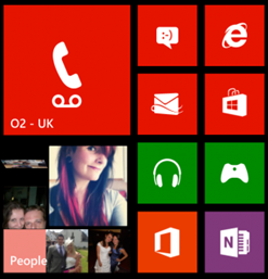
But, it was Windows Phone that took what we used to call the Metro style to the limit. That team created a crisp and clean design language that was magically pervasive and universally appreciated. Windows 8.0 adopted it, Windows 8.1 gets even more like Phone.
Smaller tiles
Windows Phone 8 introduced the smaller tiles on the Start screen. Windows 8.1 does the same. I love this, by the way, because I like to have stuff on my Start screen, but I don’t like scrolling.
 |  |
| Windows Phone | Windows 8.1 |
The ellipsis
Windows Phone 7 introduced the menu ellipsis. Windows 8.1 does the same. I love this, by the way, because there is no affordance or intuitive reason to swipe from the bottom edge.
 |  |
| Windows Phone | Windows 8.1 |
Conclusion
Nobody is copying anybody, after all. We are just adopting lessons learned from our various platforms. Has Windows Phone benefited from Windows? Of course. Has Windows benefited from Windows Phone, absolutely yes. Windows Phone is the zenith of user experience.
…so many other ways, too.


0 comments:
Post a Comment